I hope you saw “China’s way to the top” on the Post’s website recently. It’s a very clear presentation of their statement and is certainly worth a look.
So say you’re an economist and you actually do need to produce a realistic estimate of when China’s GDP surpasses that of the USA. Can you use such an approach? Not really. There are several simplifying assumptions the Post made that are perfectly reasonable. However, if the goal is an analytical output from a highly random system such as GDP growth, one should not assume the inputs are fixed. (I’m not saying I have any gripe with their interactive. This post has a different purpose.)
Why is this? The short answer is that randomness in any system can change its output drastically from one run to the next. Even if the mean from a deterministic analysis is correct, it tells us nothing about the variance of our output. We really need a confidence interval of years when China is likely to overtake the USA.
We’ll move in the great tradition of all simulation studies. First we pepare our input. A CSV of GDP in current US dollars for both countries from 1960 to 2009 is available from the World Bank data files. We read this into a data frame and calculate their growth rates year over year. Note that the first value for growth has to be NA.
gdp <- read.csv('gdp.csv')
gdp$USA.growth <- rep(NA, length(gdp$USA))
gdp$China.growth <- rep(NA, length(gdp$China))
for (i in 2:length(gdp$USA)) {
  gdp$USA.growth[i] <- 100 * (gdp$USA[i] - gdp$USA[i-1]) / gdp$USA[i-1]
  gdp$China.growth[i] <- 100 * (gdp$China[i] - gdp$China[i-1]) / gdp$China[i-1]
}
We now analyze our inputs and assign probability distributions to the annual growth rates. In a full study this would involve comparing a number of different distributions and choosing the one that fits the input data best, but that’s well beyond the scope of this post. Instead, we’ll use the poor man’s way out: plot histograms and visually verify what we hope to be true, that the distributions are normal.
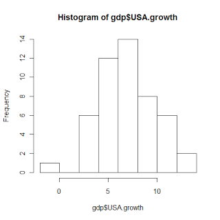
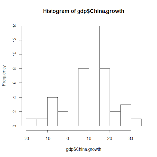
And they pretty much are. That’s good enough for our purposes. Now all we need are the distribution parameters, which are mean and standard deviation for normal distributions.
> mean(gdp$USA.growth[!is.na(gdp$USA.growth)])
[1] 7.00594

> sd(gdp$USA.growth[!is.na(gdp$USA.growth)])
[1] 2.889808

> mean(gdp$China.growth[!is.na(gdp$China.growth)])
[1] 9.90896

> sd(gdp$China.growth[!is.na(gdp$China.growth)])
[1] 10.5712</code></pre>
Now our input analysis is done. These are the inputs:
$$ \begin{align*} \text{USA Growth} &\sim \mathcal{N}(7.00594, 2.889808^2)\\ \text{China Growth} &\sim \mathcal{N}(9.90896, 10.5712^2) \end{align*} $$
This should make the advantage of such an approach much more obvious. Compare the standard deviations for the two countries. China is a lot more likely to have negative GDP growth in any given year. They’re also more likely to have astronomical growth.
We now build and run our simulation study. The more times we run the simulation the tighter we can make our confidence interval (to a point), so we’ll pick a pretty big number somewhat arbitrarily. If we want to, we can be fairly scientific about determining how many iterations are necessary after we’ve done some runs, but we have to start somewhere.
repetitions <- 10000
This is the code for our simulation. For each iteration, it starts both countries at their 2009 GDPs. It then iterates, changing GDP randomly until China’s GDP is at least the same value as the USA’s. When that happens, it records the current year.
results <- rep(NA, repetitions)
for (i in 1:repetitions) {
  usa <- gdp$USA[length(gdp$USA)]
  china <- gdp$China[length(gdp$China)]
  year <- gdp$Year[length(gdp$Year)]

  while (TRUE) {
    year <- year + 1

    usa.growth <- rnorm(1, 7.00594, 2.889808)
    china.growth <- rnorm(1, 9.90896, 10.5712)

    usa <- usa * (1 + (usa.growth / 100))
    china <- china * (1 + (china.growth / 100))

    if (china >= usa) {
      results[i] <- year
      break
     }
  }
}
From the results vector we see that, given the data and assumptions for this model, China should surpass the USA in 2058. We also see that we can be 95% confident that the mean year this will happen is between 2057 and 2059. This is not quite the same as saying we are confident this will actually happen between those years. The result of our simulation is a probability distribution and we are discovering information about it.
> mean(results)
[1] 2058.494

> mean(results) + (sd(results) / sqrt(length(results)) * qnorm(0.025))
[1] 2057.873

> mean(results) + (sd(results) / sqrt(length(results)) * qnorm(0.975))
[1] 2059.114</code></pre>
So what’s wrong with this model? Well, we had to make a number of assumptions:
- We assume we actually used the right data set. This was more of a how-to than a proper analysis, so that wasn’t too much of a concern.
- We assume future growth for the next 40-50 years resembles past growth from 1960-2009. This is a bit ridiculous, of course, but that’s the problem with forecasting.
- *We assume growth is normally distributed and that we don’t encounter heavy-tailed behaviors in our distributions. We assume each year’s growth is independent of the year before it. See the last exercise.
Here are some good simulation exercises if you’re looking to do more:
- Note how the outputs are quite a bit different from the Post graphic. I expect that’s largely due to the inclusion of data back to 1960. Try running the simulation for yourself using just the past 10, 20, and 30 years and see how that changes the result.<
- Write a simulation to determine the probability China’s GDP surpasses the USA’s in the next 25 years. Now plot the mean GDP and 95% confidence intervals for each country per year.
- Assume that there are actually two distributions for growth for each country: one when the previous year had positive growth and another when it was negative. How does that change the output?