I attended DPSOLVE 2023 recently and found lots of good inspiration for the next version of Nextmv’s Decision Diagram (DD) solver, Hop. It’s a few years old now, and we learned a lot applying it in the field. Hop formed the basis for our first routing models. While those models moved to a different structure in our latest routing code, the first version broke ground combining DDs with Adaptive Large Neighborhood Search (ALNS), and its use continues to grow organically.
A feature I’d love for Hop is the ability to visualize DDs and monitor the search. That could work interactively, like Gecode’s GIST, or passively during the search process. This requires automatic generation of images representing potentially large diagrams. So I spent a few hours looking at graph rendering options for DDs.
Manual rendering
We’ll start with examples of visualizations built by hand. These form a good standard for how we want DDs to look if we automate rendering. We’ll start with some examples from academic literature, look at some we’ve used in Nextmv presentations, and show an interesting example that embeds in Hugo, the popular static site generator I use for this blog.
All the literature on using Decision Diagrams (DD) for optimization that I’m aware of depicts DDs as top-down, layered, directed graphs (digraphs). Some of the diagrams we come across appear to be coded and rendered, while some are fussily created by hand with a diagramming tool.
Academia
I believe most of of the examples we find in academic literature are coded by hand and rendered using the LaTeX TikZ package. Below is one of the first diagrams that newcomers to DDs encounter. It’s from Decision Diagrams for Optimization by Bergman et al, 2016.
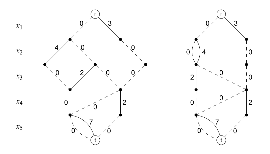
It doesn’t matter here what model this represents. It’s a Binary Decision Diagram (BDD), which means that each variable can be $0$ or $1$. The BDD on the left is exact, while the BDD on the right is a relaxed version of the same.
There’s quite a bit going on, so it’s worth an explanation. Let’s look at the “exact” BDD on the left first.
- Horizontal layers group arcs with a binary variable (e.g. $x_1$, $x_2$).
- Arcs assign either the value $0$ or $1$ to their layer’s variable. Dotted lines assign $0$ while solid lines assign $1$.
- Arc labels specify their costs. The BDD searches for a longest (or shortest) path from the root node $r$ to the terminal node $t$.
The “relaxed” BDD on the right overapproximates both the objective value and the set of feasible solutions of the exact BDD on the left.
- The diagram is limited to a fixed width (2, in this case) at each layer.
- The achieve this, the DD merges exact nodes together.
- Thus, on the left of the relaxed BDD, there is a single node in which $x_2$ can be $0$ or $1$.
Here’s another example of an exact BDD from the same book.
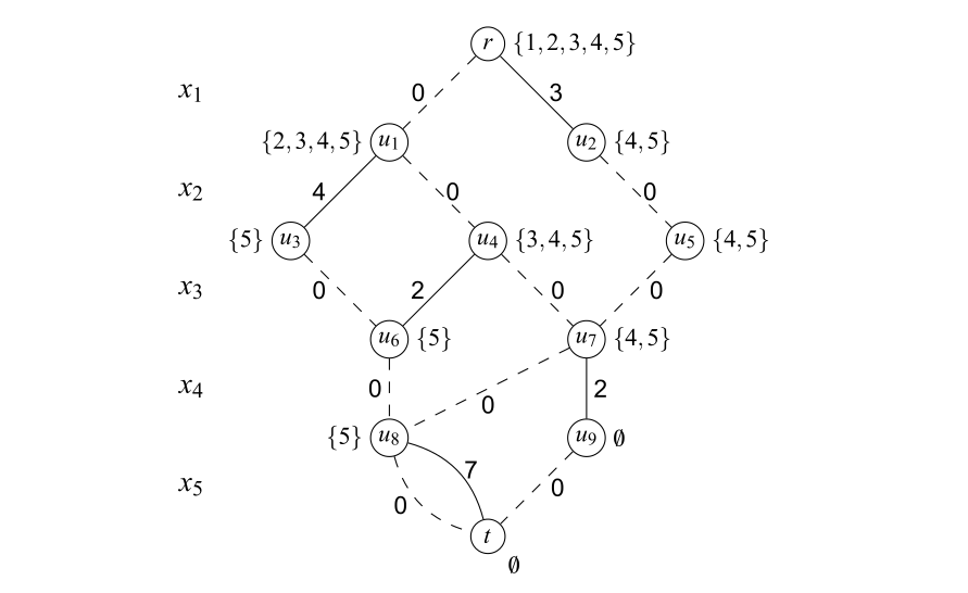
In this diagram, each node has a state. For example, the state of $r$ is $\{1,2,3,4,5\}$. If we start at the root node $r$ and assign $x_1 = 0$, we end up at node $u_1$ with state $\{2,3,4,5\}$.
Most other academic literature about DDs uses images similar to these.
Nextmv
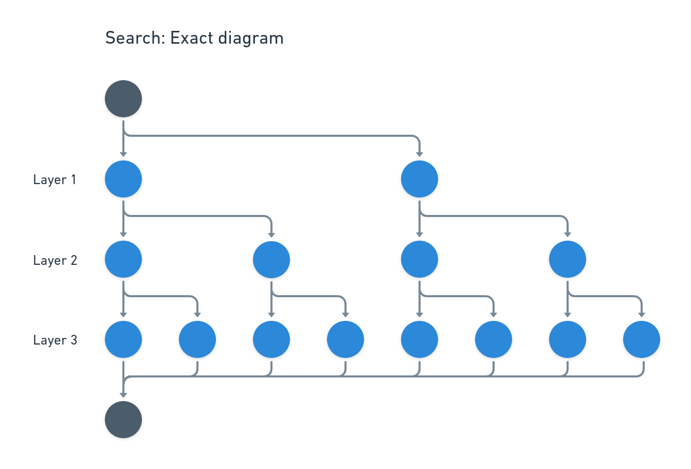
We’ve rendered a number of DDs over the years at Nextmv. Most of these images demonstrate a concept instead of a particular model. We usually create them by hand in a diagramming tool like Whimsical, Lucidchart, or Excalidraw. I built the diagrams below by hand in Whimsical. I think the result is nice, if time consuming and fussy.
This is a representation of an exact DD. It doesn’t indicate whether this is a BDD or a Multivalued Decision Diagram (MDD). It doesn’t have any labels or variable names. It just shows what a DD search might look like in the abstract.
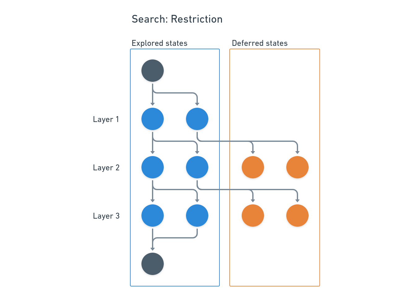
The restricted DD below is more involved. It addition to horizontal layers, it divides nodes into explored and deferred groups. Most of the examples I’ve seen mix different types of nodes, like exact and relaxed. I really like differentiating node types like this.
In this representation, deferred nodes are in Hop’s queue for later exploration. Thus they don’t connect to any child nodes yet. This is the kind of thing I’d like to generate with real diagrams during search so I can examine the state of the solver.
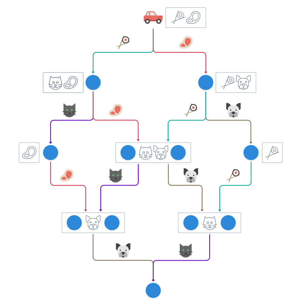
My favorite of my DD renderings so far is the next one. This shows a single-vehicle pickup-and-delivery problem. The arc labels are stops (e.g. 🐶, 🐱). The path the 🚗 follows to the terminal node is the route. The gray boxes group together nodes to merge based on state to reduce isomorphisms out of the diagram.
We also have some images like those in our post on expanders by hand. As you can see, coding these by hand gets tedious.
GoAT
TikZ is a program that renders manually coded graphics, while Whimsical is a WYSIWYG diagram editor. I like the Whimsical images a lot better – they feel cleaner and easier to understand.
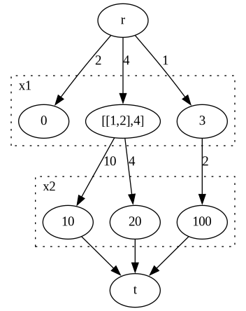
Hugo supports GoAT diagrams by default, so I tried that out too. Here is an arbitrary MDD with two layers. The $[[1,2],4]$ node is a relaxed node; it doesn’t really matter here what the label means.
I like the way GoAT renders this diagram. It’s very readable. Unfortunately, it isn’t easy to automate. Creating a GoAT diagram is like using ASCII as a WYSIWYG diagramming tool, as you can see from the code for that image.
                                .-.
                   .-----------+ o +-----------.
                  |             '+'             |
                  |              |              |
                  v              v              v
                 .-.        .---------.        .-.
        x1      | 0 |      | [[1,2],4] |      | 3 |
                 '-'        '----+----'        '+'
                                 |              |
                    .------------+              |
                   |             |              |
                   v             v              v
                 .--.          .--.           .---.
        x2      | 10 |        | 20 |         | 100 |
                 '-+'          '-+'           '-+-'
                   |             |              |
                   |             v              |
                   |            .-.             |
                    '--------->| * |<----------'
                                '-'
Automated rendering
Now we’ll look at a couple options for automatically generating visualizations of DDs. These convert descriptions of graphs into images.
Graphviz
Graphviz is the tried and true graph visualizer. It’s used in the Go pprof library for examining CPU and memory profiles, and lots of other places.
Graphviz accepts a language called DOT. It uses different layout engines to convert input into a visual representation. The user doesn’t have control over node position. That’s the job of the layout engine.
Here’s the same MDD as written in DOT. The start -> end lines specify arcs in the digraph. The subgraphs organize nodes into layers. We add a dotted border around each layer and a label to say which variable it assigns. There isn’t any way of vertically centering and horizontally aligning the layer labels, so I thought it make more sense this way.
digraph G {
    s1 [label = 0]
    s2 [label = "[[1,2],4]"]
    s3 [label = 3]
    s4 [label = 10]
    s5 [label = 20]
    s6 [label = 100]

    r -> s1 [label = 2]
    r -> s2 [label = 4]
    r -> s3 [label = 1]
    s2 -> s4 [label = 10]
    s2 -> s5 [label = 4]
    s3 -> s6 [label = 2]

    subgraph cluster_0 {
        label = "x1"
        labeljust = "l"
        style = "dotted"
        s1
        s2
        s3
    }

    subgraph cluster_1 {
        label = "x2"
        labeljust = "l"
        style = "dotted"
        s4
        s5
        s6
    }

    s4 -> t
    s5 -> t
    s6 -> t
}
The result is comprehensible if not very attractive. With some fiddling, it’s possible to improve things like the spacing around arc labels. I couldn’t figure out how to align the layer labels and boxes. It doesn’t seem possible to move the relaxed nodes into their own column either, but that limitation isn’t unique to Graphviz.
Mermaid
Mermaid is a JavaScript library for diagramming and charting. One can use it on the web or, presumably, embed it in an application.
Mermaid is similar to Graphviz in many ways, but it supports more diagram types. The input for that MDD in Mermaid is a bit simpler. Labels go inside arcs (e.g. -- 2 -->), and there are more sensible rendering defaults.
graph TD
    start((( )))
    stop((( )))
    A(0)
    B("[[1,2],4]")
    C(3)
    D(10)
    E(20)
    F(100)

    start -- 2 --> A
    start -- 4 --> B
    start -- 1 --> C
    B -- 10 --> D
    B -- 4 --> E
    C -- 2 --> F
    D --> stop
    E --> stop
    F --> stop

    subgraph "x1 "
        A; B; C
    end
    subgraph "x2"
        D; E; F
    end
The result has a lot of the same limitations as the Graphviz version, but it looks more like the GoAT version. The biggest problem, as we see below, is that it’s not possible to left-align the layer labels. They can be obscured by arcs.
This got me thinking that there isn’t a strong reason DDs have to progress downward layer by layer. They could just as easily go from left to right. If we change the opening line from graph TD to graph LR, then we get the following image.
I think that’s pretty nice for a generated image.